Sunday, February 16, 2014

Early Kitchen Studies

In the first half of the 20th century there was a lot of interest in work place efficiency, and a  lot of research went into making factories and workplaces safer and more ergonomic. This research extended into the home in the evolving area of home economics. Universities and companies funded research on tools and systems to bring the ideas that were being brought into factories, into the home.

We have mentioned here before the work of Frank and Lillian Gilbreth. The couple worked as “efficiency engineers” and worked together to help companies find more efficient and less fatiguing ways of working. When Frank died unexpectedly, Lillian, who had a PhD in Psychology, was left to try and ply her trade in this deciedidly men’s world. She turned to the evolving area of “home economics”. Though not much of a cook herself, she found she was able to bring the ideas of “motion minded” work into the home, and most importantly to us into the kitchen.
Lillian Gilbreth's experimental kitchen designed for the Brooklyn Borough
Gas Co 1930. The 6" squares on the floor make a conveniant grid for charting
travel paths during work sequences. Above the refrigerator is a flow chart
showing travel paths for given tasks. The long narrow list just to the left is a process
chart, which lists the movements and "therbligs" that constitute each task. The
drawing above the stove is captioned, "Circular Routing of Work"
 In the 1920’s she was hired by the Brooklyn Gas Company to design an ergonomic kitchen. Product placement was probably a big part of this study because gas and electric companies were in pitched battles to sell their appliances. As part of a trade show, she was hired to set up her “kitchen practical”.  In this mock up many of the ideas that are a part of modern kitchen design were illustrated. Appliance and counter space layout, the infamous “triangle”, different counter heights for different tasks, and the grouping of kitchen tools to make a particular kitchen task easier, like a baking center, or clean up center.


Another interesting study was the Cornell kitchen, subtitled: “product design through research”.  This happened later, in the 1950s and used many of the ideas from the Gilbreths’ earlier work on layout and “work centers”. The study also focused on the sociological aspects of kitchen layout, and how this workplace, the kitchen, was increasingly becoming the social center of the house, as Lillian had predicted.
There were a lot of interesting aspects to this study, but to me the main focus was cabinet and counter materials and cabinet construction.  They espoused the idea of modular cabinet construction; boxes that could come apart and be reconfigured for different layouts, all while keeping the ideas of good kitchen layout in mind. There were lots of drawers and pullouts in the base cabinets; not a lot of uppers crowding the work areas; and motion minded work centers. This was the beginning of the modular kitchen cabinet design that has been wholeheartedly adopted by companies like Ikea.
The odd thing about all this research was how little of it was adopted by American cabinet manufacturers and kitchen designers. Most of the kitchens we tear out of houses are not that old, but are also not that nice and seem to have been built and installed without any knowledge of the research of the last century. Too many doors, crowding appliances without adequate counter space in the right areas, and of course little consideration of work areas.

This makes me think of the hackneyed quote “Those without knowledge of the past are doomed to repeat it”.

Tuesday, February 11, 2014

Accessible Kitchens, or, should all kitchens be accessible?

We do quite a few accessible kitchens, and we love doing them. They are useful and important to people, of course, but they are also interesting and fun to do. An accessible project requires good layout and good ergonomics, and a high level of collaboration with the client.

There's a slideshow of some of these projects on our website.  Click here to see it.

Though there are generic standards for accessible kitchens, many of which are based on the Americans with Disabilities Act, we've found that it's much better to develop the design from the actual needs and situation of the people who will use the kitchen. The standard fix only roughly approximates what a real person will want or need; we've worked on some projects where we had to tear out an ADA-compliant kitchen to put in something that would actually allow the real users to use the kitchen.

However, there are some features or concepts that usually will come into play.

1: Drawers in base cabinets. Drawers are more convenient and accessible for most contents and most users, and that particularly applies to anyone with special needs.

2: Lower upper shelves. The standard placement of upper cabinets is actually rather high for convenience. For disabled users, or just for shorter people in general, lower is much better. We place uppers 16” above the counter, or even lower.

3: Counter heights that work. Standard 36” counters are OK for many uses, but don't work for everybody. It's good to tailor counter heights for actual users. For many people, including almost everyone with mobility issues, lower counters should be considered. It can make all the difference. It's often best to provide a variety of working heights in a kitchen.

4: Place to work seated. Early research kitchens always had a place where the cook could work seated. That's still a good idea for anyone, but even more so in an accessible kitchen. Often a knee space at the sink is needed.

5: Good lighting, easy to use faucets, D-pulls that are easy to grasp.

6: Flexibility for the future. People's needs change over time, particularly as they age. A kitchen that's accessible today might not work tomorrow. A good design should be adaptible.

The photos below show the renovated Horton House at Highlander Center in New Market, TN. Click here to read more about this project on our website.


Figure 1, Horton House at Highlander Center, Photo by Charis Horton

Figure 2, Horton House at Highlander Center, Photo by Charis Horton

Figure 3, Horton House at Highlander Center, Photo by Charis Horton

This kitchen was going to be used by a variety of people, so we wanted it flexible. It's fairly standard to look at (figure 1). But to provide a lower work counter, with a kneespace, there's a pullout counter. If a disabled resident was coming for an extended stay, some further adaptations are easily done. The whole cabinet under the pullout rolls out, to create a bigger kneespace. The rollout cabinet becomes a lower counter. (figure 2). There's no kickspace under the sink; the doors can come off their hinges to create a kneespace.

There are other good examples on our website.

But I think there is another important point to be made. It often makes a lot of sense to incorporate some of these ideas in any kitchen. After all, we all age, our needs change. We might be injured at times. Older, shorter, or tired people might want to cook in any kitchen. Sometimes it's nice to sit down to work. We always incorporate some of these features in our kitchens, like the plethora of drawers. But the other stuff should be considered too.

Wednesday, January 22, 2014

Laying Out Drawer Sizes: Why We Do It and How We Do It


The usual practice in cabinet manufacturing is to offer a few standard drawer configurations, often getting deeper toward the bottom of the cabinet.

One of the advantages of custom building is that there's no need to standardize. You and your customer can think through each drawer: what should go there, how much space it needs, and what dividers might be useful.

If you do this kind of planning, you'll often end up with more drawers, and maybe 15% to 25% greater storage capacity overall. It's also worth mentioning that big drawers are a good value in custom cabinets, because the labor in a wide drawer is about the same as in a smaller one.

For example, 3” is plenty for silver, but 3.5” is better for utensils.There's also no unbending requirement to put the biggest drawers at the bottom. You might decide that you have this heavy mixer you use a lot, which requires a 13” drawer. Maybe you want it in a top drawer so you don't have to bend down to pull it out.

Another factor is what we call the “optimum reach zone.” The top two drawers, the back of the counter, and the lower shelves on the wall are the absolutely best, most convenient, easiest-to-access storage. You don't have to be tall or have good knees to get at that stuff. So in planning drawers, we often put the most-used items in the upper one or two drawers. It saves a lot of needless walking, bending, and searching while cooking or cleaning up.

Of course, for regular readers of this blog, I don't have to mention the First Rule of Gilbrethian Ergonomic Design: Storage at point of first use! Whenever possible store things where you will be located when you need that thing. The things you use the most get the premium storage.

In Figure 1, the boxy top drawer in Cabinet F is for bottles of oils and sauced, right by the stove. To the left, two drawers for spices. These are constantly used items, stored right where they are used.


Figure 1 - Custom Drawer Sizes

Usually my customers and I work over these locations a number of times to get it right.

We start by figuring out what kind of drawer hardware they want. If we use side-mount Accuride, you'd have about 26” of capacity to distribute over 4 drawers. With those hidden softclose “Blumotion” drawers, you have more like 23”, because the hardware takes up space between drawers. With the less costly Blum Metabox drawer system, you get around 24”. In a three drawer stack, you get a little more.

I give people a little chart of typical depths of drawers for certain contents (Figure 2) as a starting point; their actual stuff may differ from these average drawer capacities.


Figure 2: Drawer Depth Chart

After we talk about it a while, we try to get a few key things located. Maybe knives, utensils, silverware, those tall bottles of oil, and so on. We take a set of elevations, and start to label what goes where. We're working toward a chart that shows the contents and depths of all the drawers in a given stack. Figure 3 is the chart for this bit of cabinetry.


Figure 3: Chart for Custom Cabinetry

This might seem confusing. But it's pretty easy, fun, and definitely worth it. Getting specific in this way often introduces a little visual variety to how the kitchen looks.

In the shop it might seem very difficult to be constantly changing your layout for hanging drawers hardware. But we make a little template stick for each bank of drawers. The stick is the height of the cabinet, and shows all the relevant clearances and dimensions. We use it for every step of the cabinetmaking process. It's not really extra work, and the results are much better.


Ian Maas using a Template Stick while creating custom cabinetry at the SCD Shop


Wednesday, January 15, 2014

The Dreaded Inside Corner Problem, or, Thanks Josette


On most projects, the issue of how best to access the inside corner comes up. That four square feet of area is mediocre storage, awkward at best, but people can't bear to see it wasted.

This is no problem if there is an outside access to the space. Just face the door or drawer cabinet to the outside. But that isn't always possible.


Outside Access to Corner Cabinet


Solutions that don't work:

The classic solution is the Lazy Susan. Usually, as the diagram shows, the Lazy Susan is three feet in diameter and has two shelves that spin around. Seems like a good idea.


Classic Lazy Susan Corner Cabinet

Of course, you lose the corners. To recover the remainder, you sacrifice a 12” adjacent space, prime storage. With two tiers, you get about 1350 square inches of shelf area.

Rev-a-shelf and other companies such as Hafele make “blind corner” units that are designed to solve the problem of wasting the adjacent space to reclaim the corner. You can see these on the web under “blind corner” storage. This is like a little train. When you pull out the storage in the adjacent cabinet, the inside corner follows it out like a little trailer. These are clever, but expensive, and you are still talking about 2 levels of storage. The ones I've seen cost $700 to $1,000. 

Perhaps that money could be spent elsewhere to better account.

Solutions that do work:

There's no one right solution; usually other factors in the design will influence what you do at the inside corner.

A simple, classic and inexpensive solution is sometimes referred to as a blind corner cab. 


Blind Corner Cabinet

Basically it's just a door cabinet at the corner where the shelves extend into the inside corner. Not a terrible solution, but to get to that interior you are down on your knees reaching back in the dark.

A variation on this is a bi-fold door at the corner. It's a little easier to use than a single door.


Bi-fold Corner Door, Stu Schaffner photo

Counter intuitively, sometimes it is better to just abandon the inside corner, and maximize the use of the adjacent spaces with wide drawers. 


Wide Kitchen Drawers. Stu Schaffner photo

It looks wasteful, but you come out ahead because the drawers give you densely packed, easy to see and retrieve storage. And there are three or four layers of it instead of two. Instead of the lazy susan's 1300 square inches of shelf, you have more like 1600 square inches with four drawers there. An interesting point is that you don't have to build any added cabinets; you are just making the adjacent ones wider.

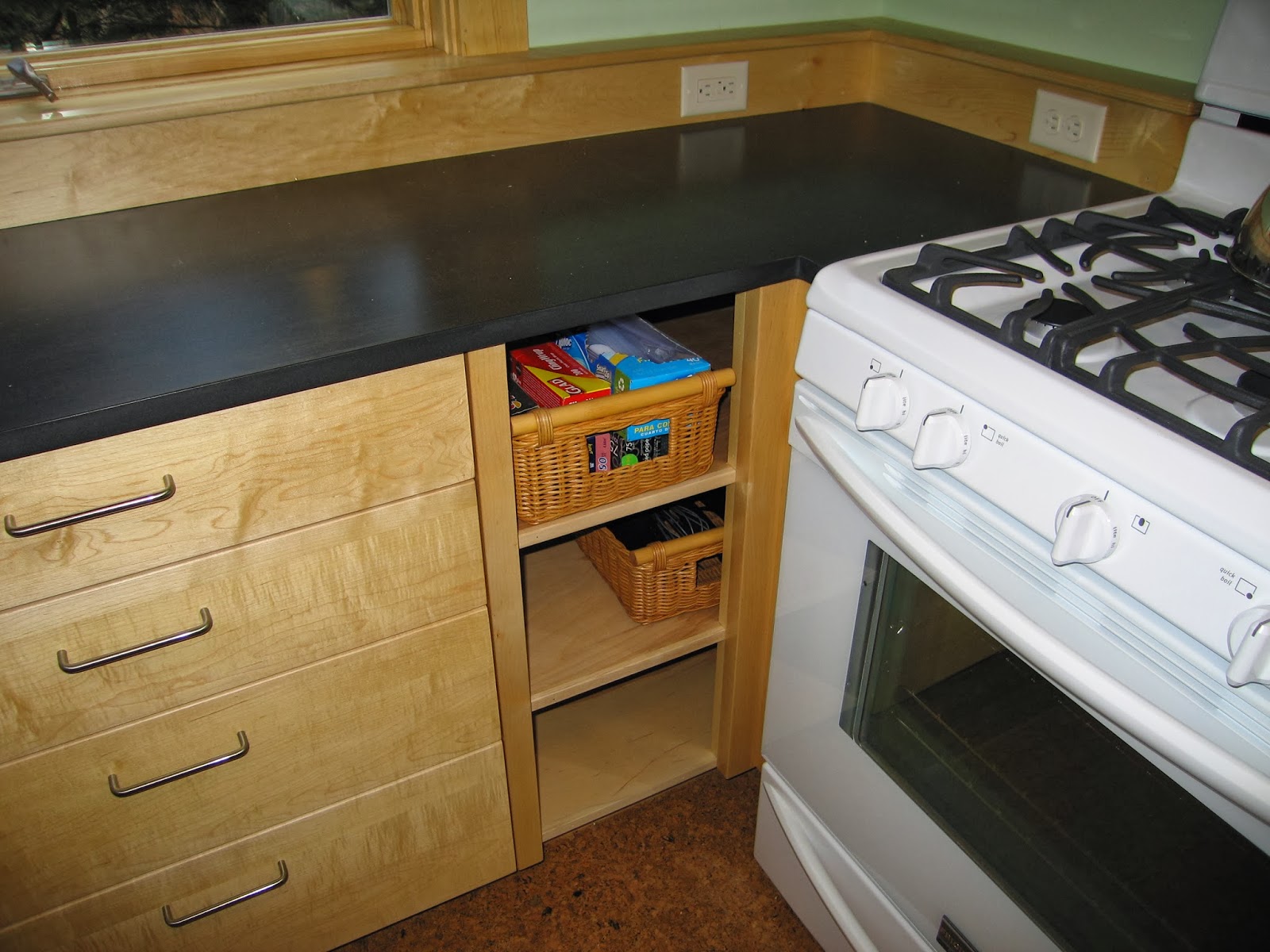
Here's a solution suggested by our customer Josette Silvers: a stack of wicker baskets that just sit on shelves. 


Corner Baskets
This is nice storage for foods like onions or garlic that like a little air, or for cloths or certain dishes, etc. The clever part is that on each shelf there is a second basket tucked into the inside corner.

This solution is so elegant and simple. It gets you some of the inside corner in a clever and economical way. It adds variety and visual interest, but is also practical.

It's pretty easy to come up with a solution that's complex and expensive. But one that solves a problem well in such a simple way is to me the essense of good design.

Thanks Josette.

Saturday, September 7, 2013

Storage Specific to Contents


Among the design problems we see a lot, I want to mention two. Often drawers are sized generically. A set of four drawers has standard sizes. But the things we put in our drawers are specific. You may have a 5” top drawer, and your contents silverware needing only 3”. Then the bottom drawer is 8”, but your stuff is 11”.

Often there are a few largish, awkwardly shaped items that don't really have a good storage spot; they often end up on the counter. Microwaves and mixers are common examples. In a small kitchen, the best work counter space can be eaten up with these items.

Designing a new kitchen, one of the most important tasks is to find a good place for these few awkward items, and in general design drawers, shelves, and other storage spots for the specific things that will be stored there.

In general, if you do this, you'll increase your available storage capacity by 25%, more or less. Looked at another way, a smaller kitchen can have more useful storage than one 25% bigger.

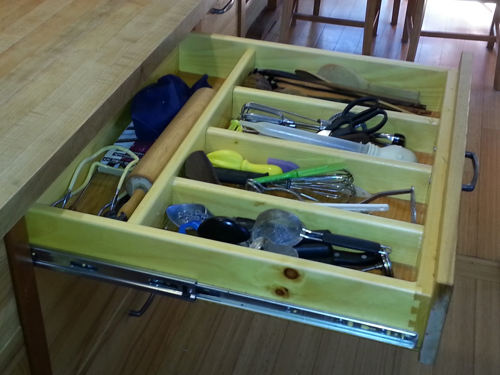
In a well thought out kitchen, any part of it might be a good example of “storage specific to contents.” But here are three of examples.  In the first, there's a niche that just fits that big mixer.  In the second, the upper cab is a little deeper to make room for a compact microwave.  In the third, that top drawer is deep enough for the utensils, but only just.

Saturday, June 1, 2013

A Craftsman Kitchen

We get to work on a lot of neat houses. Sometimes they are ordinary houses, and we hope that when we're done, they aren't ordinary any more.

But occasionally we get to work on houses that are particularly thrilling to work on for one reason to another.

This is David and Ann McCann's house in Watertown. It's a beautiful Craftsman style cottage, which they have beautifully fixed up.

These two pictures will give a sense of how neat this house is.


We wanted the new kitchen to fit the house, be a little old fashioned, and use materials that might have been used when the house was first built. It will look even better when the tilework and the new kitchen table are completed.

Our new end panel design: pine panel, cherry trim, soapstone counter and sink

The window opens into the sunroom, which you can see in the photo. Rather than tear out the tall window to line up with the counters, Chris framed a piece of stained glass that Ann and David had into the existing sash.


Things don't always have to match. We've got birch, mahagony, and soapstone counters. Pine with cherry trim cabinets; and some paint.

Contracting by Chris Gorton; Colors by Ann McCann; Cabinets by Ian Maas and Todd Krumperman.


Sunday, April 7, 2013

What makes a good kitchen?


What's the difference between a good kitchen and a kitchen that doesn't work for people?

On many projects, the answer involves big and expensive appliances, granite tops, in short, bigness in many guises. That's all fine, but to me there are other things that are more important: light, a simple compact but efficient layout, a couch in the corner to sit and read the paper on.

Actually this blog post is mostly an opportunity for me to try to operate my new smart phone as a video camera. You can click on the link below to have a look.

http://www.youtube.com/watch?v=fuPl87zqwj8

Sam